Marshall’s Interiors
We provided a nice rebrand for Marshall’s Interiors in sunny Johnstone. Originally a branch of the family-run Carpets Plus, the owner David wanted to move into a more complete interiors solution offering wallcoverings and soft furnishings in addition to the carpets and flooring they are known for.
We created a clean, contemporary design that feels at home in Scotland as it is today, incorporating a little bit of tartan detailing and some nice photography for the adverts as well.
We’re looking forward to seeing how the rest of the transformation takes shape!
Alvic Sliding Wardrobes
We have designed and printed multiple items for Alvic over the past few years. From some lovely spot-UV laminated business cards, to product brochures and more recently some updates and flyers when they moved to a new HQ too. Their charcoal, orange and white colour scheme is very striking and holds up well against the competition.
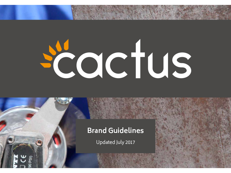
Cactus Industrial Brand Development
We took Cactus Industrial’s strong existing logo, and developed a brand presence based on a limited colour palette and metal textures. Their products are fairly niche within the energy and renewables sector so it was important to have a strong and recognisable brand to give them a presence in a competitive market.
We also developed sub logos to represent their two major product catergories which could be used across their marketing materials to differentiate what products do what job.
This style was rolled out across multiple exhibition stands and other printed materials to create a cohesive brand feel.
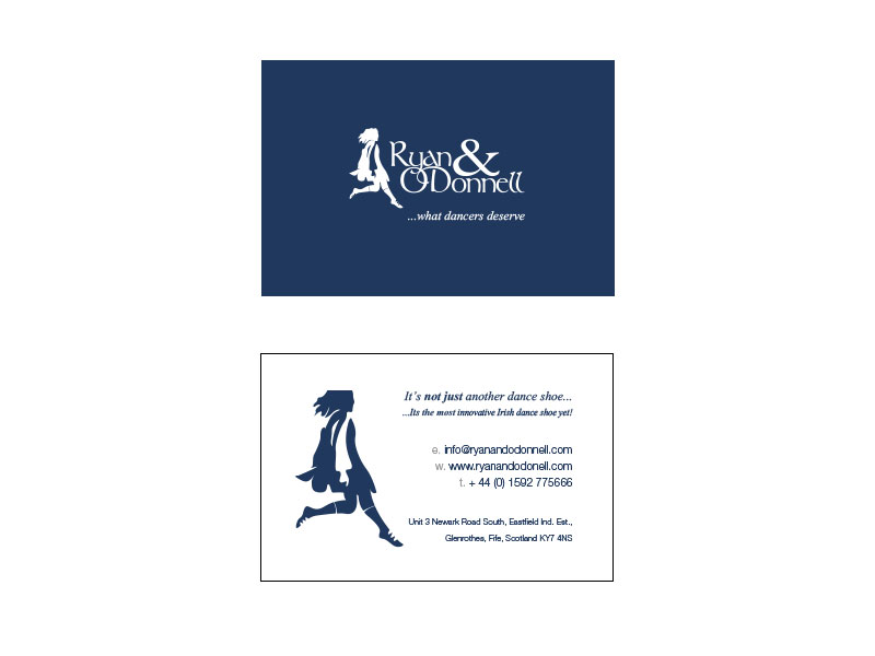
AE Struthers Print Design
We provide design and print services to AE Struthers, a well-known Scottish dance shoe manufacturer. Over the years we have produced business cards, many different leaflets and brochures, as well as product catalogues for use in print and online.
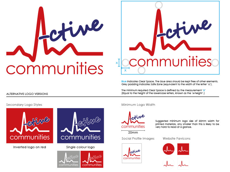
Active Communities Branding
Active Communites are a Renfreshire based organisation focused on local community health and fitness. They tasked us with a development and streamlining of their branding to incorporate their multiple sub-brands and groups into a single, more coherent style. As they had adopted all the various groups and events into the Active Communities family, each had it’s own logos and colours which made it difficult to explain how they were all related. We worked closely with the Active Communities team to understand how all the groups were linked and created and revised logos and styles as appropriate to tie them all together.
As well as the logos, we also created templates for Active Communities poster and leaflet promotional materials, as well as digital content for them to share on their social media channels.
This was all compiled into an easy-to-use brand guidelines and style document.
As well as all of the above, we have produced their annual reports, plus numerous other reports and workbooks for Active Communities, both printed and digital, which help them tackle health issues in schools and the community as a whole. Keep up the great work guys!